
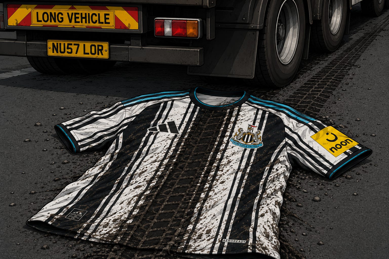
Cracking the Da Vinci (Bar)code
Our resident leisurewear correspondent Scott (speciality - cardigans) has been sizing up the new kit
“A disgrace to the traditions of Newcastle United!”
“What are they making us wear?”
Those aren't from this week, as everyone debates the new Newcastle United kit; these are from the early nineties as the original barcode was rolled out by the original strip agitators Umbro. Twenty years later it was part of an exhibition in Manchester hailing strip design and innovation.
Us? There is a small market on various selling sites for these tops which produces more money per annum than a small country. Even fake or rehashed versions will cost you upwards of £40.
It's fair to say, since its humble beginnings that that top’s fabric is now woven into Newcastle strip cult folklore and still no one really knows if it's good or not. But everyone went and had a look in their parents' lofts to see if those stains would come off enough to sell it.
Umbro at the time, were just cracking the market. In the late 80’s, for the first time ever, they were mass producing replica kits and marketing it so that you could look like your heroes.
The shirt, shorts and socks fitted snuggly into a cardboard box around the size of a Manilla envelope with a clear front so you could see the shirt and drool. Kids were insistent, big kids were insistent. ‘Repli-kits’, as they were called,were flying off the shelves.
Italia 90 brought a new market to football and Umbro didn't just stop with the mass produce. The design teams were going to the Hacienda, enjoying all that comes with that, and then designing a strip after getting a kebab on the way home.
Newcastle was radical because it was the first time ever that the sacred cow was tampered with (if you know what I mean) but it was nothing compared to some teams. Sheffield United had a fluorescent yellow away kit, Sheffield Wednesday had green and white hoops. Google “Ajax third kit”, but make sure you are in a darkened room, and even our away kit can be described as ‘bold’.
The new kit dovetails that story closer than you think.
It's not my cup of tea, let me make that clear and I’ve worn some kits for five a side that should never have gotten off a designer's sketch pad, but I'm 47 and I'm not in the demographic, I'm afraid. Adidas haven't designed the kit for someone nearly 50 who lives in Northumberland. They have designed this to be sold to fashionistas worldwide and it shows.
That in itself I don't have a problem with and the moment Adidas jumped into bed with Newcastle for a hell of a lot of money - and make no mistake it was a giant leap for them as at that stage we had zero commercial rating after years of being mugged by iron Mike, and no commercial market to tap into - they were going to do what the hell they wanted.
The warning signs were there. I remember walking through Glasgow a few years ago and my eyes nearly popped out of my head how they had tampered with the green and white hoops of another iconic kit. Meanwhile, Juventus have had some shirts lately that would make the Grand old lady run for the Alps.
This kit will have been in the pipeline for years now. It will have been designed with this season in mind. Adidas have tested the water with incessant and expensive rehashes of old strips and with these kits, this season, the brand with the three stripes will be going past ten different designs since taking over from Castore a few years ago. At that time, Adidas were all shiny and new and a clear indicator of us being on the up. They sold in huge units.
Two so-so efforts which have towed the line have been released but now they are blasting the company line into smithereens on the third home kit. You know this time next year it's back to bold black and white and people will buy it by the boatload, because it will seem like the best kit ever compared to the one this season.
The Adidas thick stripes which will adorn the shoulders of all 2026 kits look awful, and when was the rule that blue was part of the home kit arranged? The last time we did that, we were relegated.
The designer of this kit will win awards eventually. In thirty years time it will be hailed as an all time classic. Maybe we will learn to love it.
Adidas made the Japanese away top in 2022 and it's a bonny effort. Pale pink with green arms and floral patterns between neck and breast. The designer told Mundial magazine in 2024:
“What drew me to football shirts is the identity they bring and I decided to customize each club and bring identity into the 21st century. I've always loved the floral designs on Dolce and Gabbana clothes and I decided to execute my idea on football shirts”.
Quite.
Like it or not football tops are like designer garments and like catwalk efforts. Some you will love and some will hate. Also in the article he explained that the brief was “the more intricate the better, as it was harder to copy”. Adidas may have just used that trick here, though DHgate and its contemporaries are already laughing in the face of that notion, probably like Sid James would laugh.
The new kit is already being described by people who will definitely be buying one, as the “worst ever Newcastle shirt” and using its very existence as a gauge of the current malaise engulfing the club.
The no sponsor thing certainly is. However it's worth noting the old barcode had three different sponsors and when Greenalls went mid season, you were given a horrible patch to sew over it. Can't see Adidas doing that. The patch would cost £30 and would have sequins.
The lack of queues for the new strip on release has been stark, but why do people still go out at 4am to be the first to wear the new kit? This will sell eventually and at the first game it will be all over the ground.
Newcastle and its fans have been done in by a designer that's maybe been to the Hacienda’s 2026 equivalent. The argument for, is that it's a bold design, different and it's fashionable.
Among the lengthy list of arguments against, are that Newcastle fans don't wear the shirt to look good on the catwalk, they wear it because it's OUR kit. It's part of our identity and this kit can be worn at all the Adidas backslapping awards ceremonies it wants, but it just doesn't feel like a Newcastle kit.
I could say in the big scheme of things a new design of a football shirt is way down the list of worries in the world at the minute, but it doesn't work like that. Football fans and football kits are sacred. Ask a Boca Juniors fan what would happen if they barcoded their blue and yellow kit. Some things you don't mess with and ours is one of those things.
I’ve got a feeling somewhere that a designer is going “In 30 years time I can say that’s my fucking kit”. Loved or not.
Adidas have always been pretentious, but this is a gamble. This will either be their Waterloo or a Netherlands 1988.
Kits also look better on better players also. The Adidas 1995 kit was lush, but looked even better when Ginola and Ferdinand brushed aside the opposition. I’m sure the original barcode wasn't seen as a classic as Mark Stimson put past his own keeper at Oldham in injury time, but improved somewhat as we were promoted as champions. This one would look good if we actually sign some good players and win a lot of games.
All I will leave you with here is what would have happened if Castore had done this? The answer is they wouldn't have dared. Adidas do dare. That's what makes them the biggest selling shirt company. I just sort of wish they had left this one alone though.
However, the old adage still stands. If you don’t like it, don’t buy it.
Scott Robson
It makes me wonder what the fuck I'm doing giving a fuck about football at all at 58. I'm so out of kilter with everything these days. Last night's world cup opener had 3 sendings off for what to me was absolutely nowt. Then the pundits start chirping on about they all deserved it. I went to bed in a rage vowing I'm done with it all, & don't think I've changed my mind this morning. That kit is dog shit awful 🤬
It's fucking hideous.